
Ian Davenport’s exploration of colour is both intellectual and emotional. His latest solo show at Cristea Roberts Gallery, Pathway, is a vibrant display of colours and dynamic compositions, blending rhythmic patterns with tonal variations. His prints evoke a sense of movement, akin to beams of light or concert visuals, offering a harmonious, almost musical experience. The symmetrical precision and nuanced tonal shifts in these works underscore his exceptional command of printmaking, seamlessly marrying meticulous technique with spontaneous expression. Avantika Pathania chats to the artist about the intricate interplay of colour, form, and technique and how Davenport's evolving printmaking practice continues to inform his broader artistic vision.
Installation view of Ian Davenport: Pathway at Cristea Roberts Gallery, London, 2024. Photo Eva Herzog. © Cristea Roberts Gallery, London
Avantika Pathania: In Pathway, you have pushed the boundaries of etching and silkscreen printing, experimenting with large-scale works, and exploring tonal variations. How has this deepening exploration of printmaking influenced your painting process over the years?
Ian Davenport: I started making prints about 20 years ago, with Cristea Roberts Gallery, and I’ve always found the way they interact with my paintings really interesting. I started to realise that the two were more intertwined than I ever thought they would be, and certain things would happen in the prints that would then inform the paintings.
One of the first print series I did was a group of etchings, when I was working on the different etching plates with different coloured grounds, I found some of the inks would soak into the dark paper. This meant that the bright colours I had originally envisaged started to almost disappear and become muted. Initially, I found that hard to deal with but then I realised this outcome was telling me something, that there was this other side which was much more interesting. The way that the dark colours were floating into the background created a lot of depth, and I started to adopt that into my paintings.
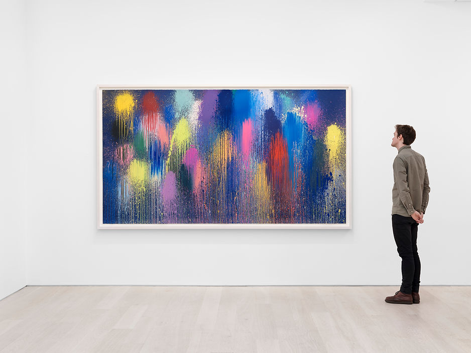
This is an example of how one process fits into another, which also relates to the prints that are central to my exhibition, the Pathway series which are the largest screen prints I’ve ever made. The first one was made as a painting; I liked it because of the way the paint pushes back up the surface to create wavy marks and lines. I wanted to see if it was possible to explore different colour variations within this image - what printing allows me to do is select an image from a painting and use that motif to explore different colour variations.
When you stand back and look at these three prints (Pathway (Turquoise), 2024, Pathway (Red), 2024, Pathway (Yellow), 2024), you see the colour, but you don’t necessarily recognise it as the same image used in three different ways. This particular print (Pathway (Red), 2024), which is predominantly red with highly saturated colours, I then translated into a painting. The name Pathway comes from my studio team helping me create colour combinations on a computer. Just by coincidence, one of the assistants called one of these images, ‘a pathway.’ And we started to refer to them as ‘pathways,’ it seemed very appropriate.

Installation view of Ian Davenport: Pathway at Cristea Roberts Gallery, London, 2024. Photo Eva Herzog. © Cristea Roberts Gallery, London
Your works are often praised for their vibrant and methodical use of colour. How do you perceive colour on an emotional or intellectual level? Do you view it as something that can communicate beyond visual aesthetics?
Absolutely, I think that’s one of the great things about art. I don’t know why certain things work the way they do, but when they register with me, I have to listen to them. At a certain point a few years ago, I started to change the composition of my paintings and made them more symmetrical. I think colour is a very intuitive thing, if you try to understand it too much, you lose the joy of it. It’s like trying to explain and understand a piece of music, it’s more about how you connect with it emotionally.
When I create something that just feels right, I know it is a successful piece. But I also like input from others — I have people in the studio with me and I work with different printmakers. I pay attention to what they’re interested in, and that can bring a new dimension to the work.
The works in this section are kind of like monoprints (Dum de Dum (Ghost), 2024 Diddle (Ghost), 2024 Dum de Dum, 2024 Diddle, 2024). They were made by inking up a plate and then printing in sequences that are aligned. The resonance of the colour is important to these works. The lines are quite broad, and the way they sit next to each other, with hot and cold areas, is carefully thought out. I made a lot of studies for these — probably around 40 colour studies — and we narrowed it down to about five or six in the end.
When I first started as an artist, I wasn’t very interested in colour. My earlier work was much more pared down, and monochromatic, with a lot of greys, blacks, and whites, often using matte and gloss surfaces. Sometimes they were completely monochrome. As I have grown as an artist, that interest in colour has become much more predominant in my work, and it’s something that just happened naturally. I think as painters, we’re really interested in light, and then light really comes from colour. My interest is predominantly in light.

Installation view of Ian Davenport: Pathway at Cristea Roberts Gallery, London, 2024. Photo Eva Herzog. © Cristea Roberts Gallery, London
What are your major influences when it comes to your artistic exploration?
I look at so many different artists across the board, Renaissance artists, and Impressionist artists, among others. With the Renaissance artists, they were beginning to discover perspective and composition, they were trying to depict human emotions for the first time – it’s fascinating to see artists start to grapple with that subject matter.
At the moment, I'm looking at Fra Angelico, an early Renaissance artist, as he uses quite a lot of gold and vibrant colours. I’ve also been looking at a lot of Impressionist and post-Impressionist painters, people like Pierre Bonnard and Monet.
Another influence is Josef Albers, an artist whose work I saw regularly at Waddington Custot Gallery. He has a famous series called Homage to the Square (1950 - 1976), where squares are layered on top of each other. It’s a simple composition but he experimented with different colour variations, exploring a wide range of experiences with such a pared-back format. That had a big impact on me: [realising] how focusing on something simple can lead to a lot of depth. I think I’ve picked up on that, as I’m probably best known for my stripe paintings. These paintings use a simple format but they allow for a lot of exploration and variation with colour.

The Pathway prints evoke a sense of movement and dynamism, like beams of light or concert visuals. How intentional is this musicality in your work, and how do you approach the rhythm of colour?
It is intentional. It happened intuitively, but I recognise it very strongly as a sort of theme in the work. When I was a child, I started to play the drums and became very interested in musical instruments; I was in various bands and things like that.
As a painter, I became interested in movement and physicality and rhythm. I was wondering how to find a way of pulling all these different things together. Through a period of process, exploration, and experimentation, this is the way that I managed to do it.
I think these paintings, this line, do have a sort of a pulse to it and a rhythm, which I think is very musical. The colour gives it a rich tone warmth, coolness and so on, which is also beautiful to play with.
In your poured paintings, time seems to play a crucial role, with the paint's flow being affected by gravity and other forces. Do you see time as a medium in itself? How do you view the relationship between control and unpredictability in your work?
About 40 years ago, when I became an art student, I was experimenting in my studio and noticed the way that paint was being pulled by gravity. At the time I was using a very fluid, commercial paint and realised it had an incredible sculptural quality. The way the material was affected by gravity became a key focus for me, leading to the development of my paintings. The unpredictable way the paint moved and was pulled by gravity made it feel very sculptural.
I’ve always had an interest in sculpture and tried making sculptures before, but I hadn’t found the right approach. However, once I saw how gravity influenced the paint, it transformed into more of a sculptural force.
Your painting process involves a high degree of physical engagement—pouring, tilting, and manipulating liquid paint. Does this physicality influence the emotional or conceptual content of your work? How does the act of creation inform the result?
Some of the simplest paintings and prints I have made, like you mentioned, involve pouring liquid paint from the centre, almost forming a kind of pancake shape. It is a very simple form, but by flipping and manipulating it, an interesting dynamic emerges between the material, the shape, and how it ultimately sits as an image. These elements—material, shape, and image—are all closely entwined in the process.


Installation view of Ian Davenport: Pathway at Cristea Roberts Gallery, London, 2024. Photo Eva Herzog. © Cristea Roberts Gallery, London
How has your artistic style evolved over the years? What would you say has driven that evolution?
I am increasingly interested in colour, although it’s been a slow process. To begin with, I started trying to pin colour down too much, trying to hold on to it, to theorize what it could be. I guess the process of the last few years has been to embrace it.
I’ve been looking at very simple formats and trying to work in series. I will make a series of prints or paintings, explore everything I can, and then use some of the experiences in the next body of work.
When you create large-scale works like the Poured Lines on Southwark Bridge, how do you envision the public’s interaction with your art? What kind of experience do you want them to have in terms of space, movement, and perception?
That was a massive undertaking in large-scale painting, and it was made nearly 20 years ago. I didn’t know how people were going to react to it, whether they would embrace it or not. Shortly after the opening, I went down to the site, the piece had been on TV, and there had been lots of press. I saw some people looking at it and asked them where they were from and they said that they were from Cornwall, which is about a six-hour train journey away [from London].
I was genuinely moved to learn that people had travelled so far just to see this artwork. It was both touching and impressive. However, it posed a challenge because of its size. The piece is a large architectural work that needs to integrate seamlessly with the cityscape. Its scale is quite unconventional for a painting—so long that it feels like you could drive alongside it. This unique dimension alters the viewing experience, making it feel quite different from traditional artworks.

Poured Lines, Southwark Street, 2009 © Ian Davenport
How do you deal with challenges in your painting process?
I do encounter challenges with my paintings from time to time. Not every piece turns out as planned, and it’s important to accept that not everything will work smoothly. When something doesn’t work, I’m not afraid to wipe it down and start again. It is all part of the process.
Art is very much about practice. While creating individual, beautiful works is important, it’s equally about embracing the entire journey and learning from it. I remind myself that the process of making art is as valuable as the finished piece. This perspective helps me appreciate the path and continue pushing forward, even when things don’t go as expected. You know that you've got to enjoy the journey.

Looking ahead, how do you envision the trajectory of your work evolving, both in terms of themes and techniques?
One recent project that I’m particularly proud of involved an architectural intervention at the Chiostro del Bramante in Rome, designed by the renowned Renaissance architect Bramante. I was invited to create a work that incorporated a staircase and extended into the cloisters. This project allowed me to introduce a free-flowing, sculptural element to my paintings, transforming them into a more immersive experience. Visitors could walk through the piece and its scale became exaggerated, creating a dynamic, river-like flow of colour.
Although I had initial sketches and ideas, the artwork developed its own energy as I worked. When my paintings reach their peak, there’s a moment where they seem to take on a life of their own, guided by the nature of the paint itself. This exploration of immersive, flowing elements continued in my recent exhibition, Lake, which featured large, colourful sections that enveloped viewers.
Additionally, I revisited some of my works on paper for an exhibition at the Burton Art Gallery in Bideford, Devon. This show offered a retrospective of 30 years of my work on paper, including experimental pieces that hadn’t been shown before. Two notable works in this exhibition involved collecting splatters from large sheets of paper, capturing accidental droplets, and creating unique textures. Currently, I’m excited to present some new large-scale works on paper, nearly three meters wide, made by projecting bold marks of paint. These pieces contrast with the more structured prints in my collection, highlighting the contrast between organized and experimental approaches in my work.
After four decades of exploring various forms of abstraction, do you see yourself continuing to build on your current methods, or are there new artistic directions or mediums you are eager to explore in the future?
Printmaking is a crucial aspect of my work, and I’m particularly proud of the prints created for this exhibition. My goal is to continually push the boundaries of scale and grandeur in printmaking, and this is something I’m eager to pursue further.
In my career, I’ve increasingly focused on how paintings interact with architectural spaces. I find it essential to explore how artworks can fit into and enhance architectural environments. Displaying art outside of commercial galleries allows a broader audience to experience it, which is rewarding. Combining these opportunities with traditional gallery exhibitions creates a dynamic approach to showcasing art.
The prints and artworks are not confined to a single category; they each have their own unique story and history. I feel fortunate to have discovered my artistic voice relatively early and to have had the support to explore and develop it. Each piece reflects its own journey and contributes to the broader narrative of my artistic practice.
What advice would you give to the future generation of artists who are currently in school or just starting?
It’s important to spend time in your studio and enjoy the process of creating. Art often involves working alone, so it’s crucial to find joy in what you make and in the journey itself. Understand that not every day will be perfect and setbacks are part of the process — embrace them and do not let them discourage you. Trust your intuition about what feels right and what works for you. Sometimes, you may not have a clear reason for a particular direction, but if it feels right, it often leads to meaningful outcomes. Over time, this approach will become clearer and more refined. Listen to your instincts
Avantika Pathania is a London-based writer and arts journalist.
